
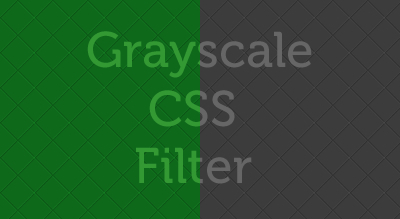
In this quick article we will see how we can get Cross Browser Gray scale images with just CSS Filter only.
Live example of this you can see on footer of this website in about us section. The gray scaled image in footer is converted using CSS filter only.
Let’s see how we can apply this filter to convert image to gray scale:
Gray Scale Image CSS Filter
[cc lang=”css”]
.my_image
{
background:url(images/main.jpg) no-repeat left top;
filter: url(“data:image/svg+xml;utf8,#grayscale”); /* Firefox 10+, Firefox on Android */
filter: gray; /* IE6-9 */
-webkit-filter: grayscale(100%); /* Chrome 19+, Safari 6+, Safari 6+ iOS */
}
[/cc]
Now get our image back to real color :
Normal Image CSS Filter
[cc lang=”css”]
.my_image:hover
{
filter: url(“data:image/svg+xml;utf8,#grayscale”);
-webkit-filter: grayscale(0%);
}
[/cc]

Good one dude…..
Can’t Firefox implement something like webkit’s?
Good one, Can it work with the old Internet explorer?
No as these features were not implemented on those old versions of IE.
Can you explain clearly about this tutorial?
I don’t get it all. Looking forward for better explanation.
However thanks for the tutorial.