Here we comes with another CSS3 tips and tricks. Earlier we have posted about the CSS3 Rainbow Effect. In this tutorial we will create pulse effect using CSS 3 property only.
[gads]
I am going to create this effect using CSS3 Keyframe Animation. Its just like to create tween effect using javascript.
This will work on browser which supports CSS3 Key Frame Animation.
Now lets go through the HTML and CSS part of this article. We will just needs three div tags and CSS style for those div tags.
HTML
[cc lang=”html”]
[/cc]
[gads]
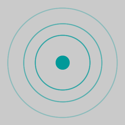
Hence class names are self explanatory. div with pulse_marker class is the middle dot and div with pulse_rays will animate and create an effect.
CSS
[cc lang=”css”]
@-webkit-keyframes pulse
{
0% {-webkit-transform: scale(0); opacity: 0;}
8% {-webkit-transform: scale(0); opacity: 0;}
15% {-webkit-transform: scale(0.1); opacity: 1;}
30% {-webkit-transform: scale(0.5); opacity: 1;}
100% {opacity: 0; -webkit-transform: scale(1);}
}
@-moz-keyframes pulse
{
0% {-moz-transform: scale(0); opacity: 0;}
8% {-moz-transform: scale(0); opacity: 0;}
15% {-moz-transform: scale(0.1); opacity: 1;}
30% {-moz-transform: scale(0.5); opacity: 1;}
100% {opacity: 0; -moz-transform: scale(1);}
}
.pulse_holder
{
display: block;
position: absolute;
top: 100px;
left: 350px;
}
.pulse_holder .pulse_marker
{
width: 16px;
height: 16px;
background: #099;
border-radius: 28px;
}
.pulse_holder .pulse_rays
{
margin: 0 auto;
border-radius: 100px;
position: absolute;
right: -26px;
top: -26px;
z-index: 10;
background-color: transparent;
opacity: 0.1;
width: 64px;
height: 64px;
border: 2px solid rgba(0, 128, 64, 1);
-webkit-border-radius: 100px;
-moz-border-radius: 100px;
-o-border-radius: 100px;
-ms-border-radius: 100px;
border-radius: 100px;
/* Giving Animation Function */
-webkit-animation: pulse 2s linear infinite;
-moz-animation: pulse 2s linear infinite;
border-image: initial;
}
[/cc]
Demo
Have a look at below image for what you will get after applying this HTML and CSS.

Alternatively you can have a look at live demo page here for the same.
Conclusion
This is how you can achieve the animation effect using CSS3 Keyframe Animation. Now in upcoming articles we will show you how to create pure css3 based COOL tooltip.
If you don’t want to miss any article or tips and tricks from us then subscribe to our RSS Feed.


Hi,
Nice pulse effect. This works only on webkit and FF browsers.
Do you have any fallback solution for IEs?
It even doesn’t work for IE9 :/
The effect looks like stuck while pulsing on IE9.
Thanks
[…] Hi guys, Here I come with very cool box effect menu using just CSS3 and HTML. I am pretty sure that you have read my one of the previous article for CSS3 Pulse Effect. […]
Hi, Nice effect..we can use it for Google Map Marker……by animating each circle with different time laps
can u know how to use this pulse effect in our google maps marker
i am getting confuse